Question

How to Customize the Admin Portal

  • 4 November 2022
  • 9 replies
  • 315 views

Is there any way to customize the admin portal. For example, the default top right hand pane (“Help Desk”) shows

  • Active Service Records Assigned to you
  • Active Service Records Not Assigned

I would like to also have a link showing “Active Service Records assigned to xyz Admin Group”.

Is there any way to achieve this?

Hi @chrisis ,

There may be two options. The first is to explore the possiblity to do a special, custom development project. The easier way, which we suggest, is for you to build a custom dashboard. It’s fairly easy and you can build out the view that you’re looking for by using a custom filter that applies to admin groups.

Here is our documentation that explains how to do this.

Best wishes,

Erik


I’m sorry but the dashboard functionality is so bad it is unusable. 


Hi @Crhis 

I’ve checked around and we really do not hear concerns about our dashboard functionality. I’m going to have your CSM, Michelle, reach out to you via email. We would like to understand your challenges and see how we can make sure that the dashboards work they way they’re expected to.

Erik


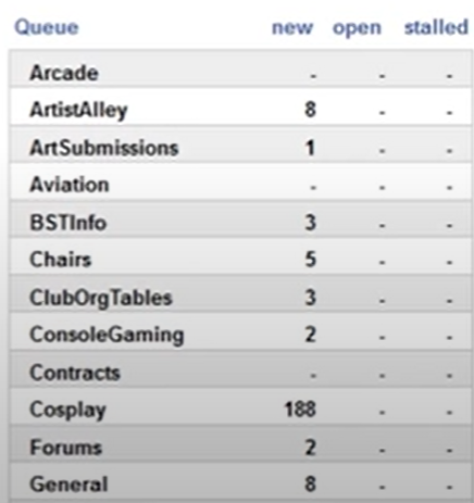
Well, my original request was to show a summary of tickets per admin group. Here is an example of what I want to see:

I do not believe the SysAid dashboard can produce anything near to that.

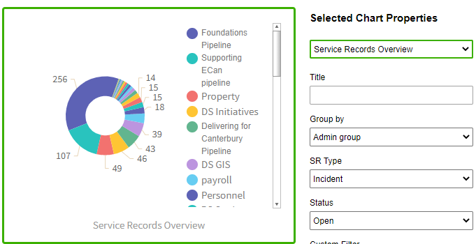
This is the closest:

However, seeing this information in a coloured donut obscures the information I am looking for. I can’t change the size of the dashboard chart, so to understand the donut I have to use the scroll bar. Even if I maximize the chart, I have to scroll. Also, I cannot change the chart type. Even a bar chart would be a better view of the data. I tried displaying the information across 2 graphs and filtering out many of the admin groups:

Unfortunately not as useful as combining everything into a single table, or even a single bar chart. Notice how the admin groups have different colours across the charts - getting a quick overview of demand and the ability to manage it is impossible. And of course I have to strictly limit the admin groups to make the data readable.

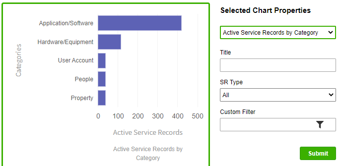
But let’s look at the bar charts I can access:

We do not have only 5 top level categories…

I could go on. I have grappled with the dashboard enough to know that it cannot do what I need from it.


@chrisis now that we see the additional screen are you familiar with our Matrix feature? 

Analytics > Matrix where you can see a dynamic table by the relevant criteria's you choose:

It’s not a dashboard but might a good solution for this data you want to review. 

also I ma forwarding your feedback to our Product team to take into account in feature designs. 

Best,


@maayan, yes, I am aware of the Matrix but unfortunately it’s not on the front page every time my admins log onto SysAid. The admin portal is the ideal place for this information:

  • currently it is mostly white space
  • when admins log on they should be able to see where demand is and whether it is being properly met
  • they shouldn’t have to go through multiple clicks and filters to see this information, easy access is crucial :)

I could just as easily run a scheduled report to export the data, then pivot table it in Excel and publish results. But it’s just as many clicks and doesn’t present the information as a seamless part of accessing SysAid.


@chrisis thanks for sharing the feedback I will make sure the relevant product managers sees it. 

Untill this is improved 2 things i can reccomend: 

  1. Making the matrix as admin’s homepage is possible through custom project so if you have PS hours to use this would be ideal for it.
  2. Suggest this as an idea and let’s see if more SysMates think the same as you about this issue and suggest solution

https://community.sysaid.com/ideas

Best, 


@Maayan I agree with Chrisis it would be nice to see the admin portal /dashboard display more  summary information similar to how the matrix can display it but show it on the admin dashboard. A more dynamic view of tickets, assigned to, status and categories etc.,  Is this a possibility? 

Thank you!


Good morning,

I have raised the same question earlier to customize the Admin Portal and especially to add “Active Service Records assigned to xyz Admin Group”.

There is a feature request for this but unfortunately no additional background information was provided by SysAid. With this being said, I can’t tell you the number.


@SysAid IT Expert - maybe you can find out and add the information in here. The ticket I’ve opened for my case is #2347403.


Thanks

Ingo


Reply